Orlando Magazine Cover
Client: Orlando Magazine - 2017
Art Director:: Anna Ware
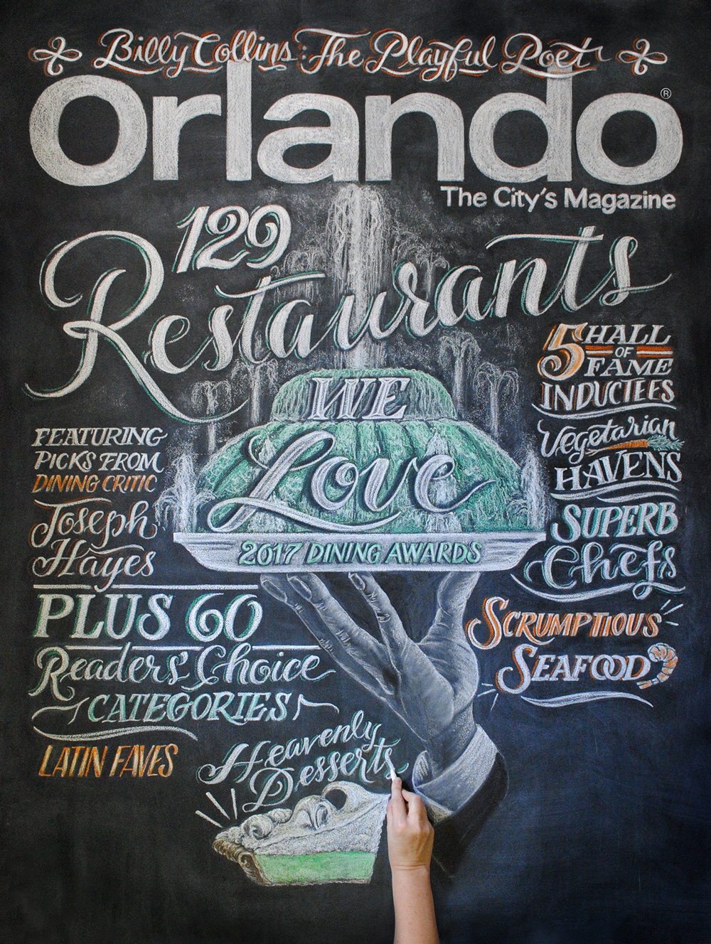
Traditional Chalk Cover Art - 4.5' x 5.5'
I had an amazing time working on this lovely magazine cover that consisted of 100% traditional chalk for Orlando Magazines Dinning Awards issue.
“I collaborated with Kim on a cover chalk illustration for a dining issue of our magazine. From the first email, Kim was easy to work with, timely and professional. I found her pricing to be affordable for our budget but for her talent could probably charge much more. We were given 3 unique sketches to choose from for our cover. The sketch we chose was clever and beautifully showcased her incredible lettering skills as well as her lifelike illustrations. As she worked on the final she graciously provided process shots and time-lapse video to share with our audience. As for the outcome, it’s not an exaggeration when I say that this cover was the one of the best that our magazine has had in our more than 70-year history. Kim is an incredible talent, a kind spirit and someone I’d highly recommend working with to any and everyone.”
Sketching ideas and putting them on paper is always instrumental. It allows me to think out loud and see what might work and what won't, narrowing elements down to place into design ideas.
The Idea Behind The Design
When I think of Orlando I instantly think of the iconic Lake Eola fountain. The cover design was based on the fact we are serving up Orlando's finest dining spots which was illustrated by serving up Lake Eola on a platter. Two design ideas were created to present before the design team. Both can be seen below. One illustrating the fountain with the other showcasing a line-up of the magazines Emmy styled food trophy.


